IBA
June 2022
Agency: YOU Agency, Art Director: Reilly Lovett, Copywriter: Ben McCarthy, UX/UI: James Morse, Designer & Animator: Silvia Scifo
Brief
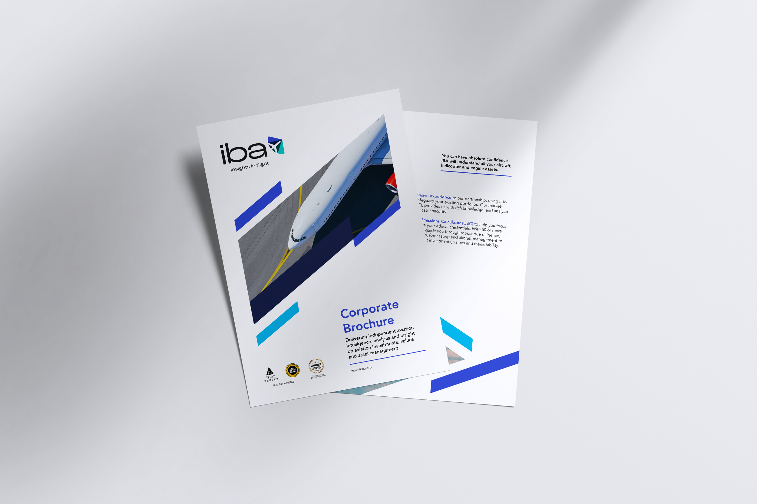
Giving the world’s leading aviation consultancy a new bold identity to reflect their core values. IBA brings rich experience, independent aviation intelligence and understanding to its collaborations with diverse commercial and corporate aviation clients across the globe. www.iba.aero
Response
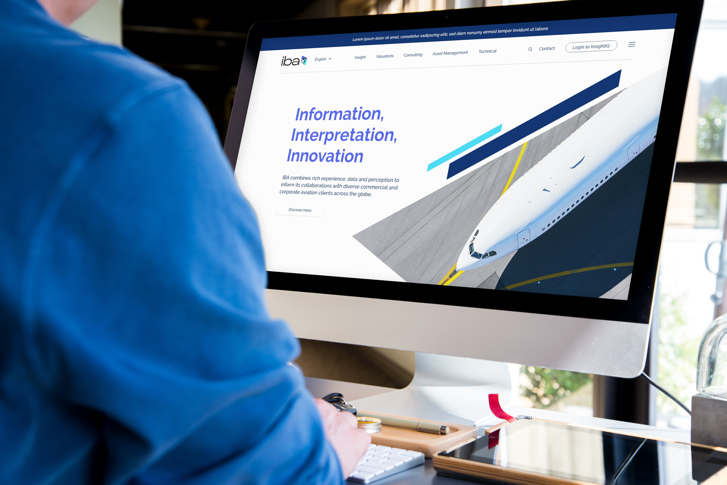
IBA, the world's leading aviation consultancy, sought a bold new identity that accurately reflected their core values. They wanted to showcase their professionalism, friendliness, and expertise. Our approach began with transforming their logo from uppercase to lowercase, creating a softer yet still modern aesthetic with a strong san-serif font. The new icon merged a pie chart, symbolizing data, with a simplified airplane graphic, representing their expertise in asset management, valuations, and data intelligence. This combination demonstrated their interconnected approach and forward-thinking mindset. The tagline, "Insights in aviation," encapsulated the brand's purpose and customer-focused approach. To ensure versatility, we introduced five sub-brands that aligned with specific aspects of the business while maintaining visual consistency. The primary color palette, including shades of blue such as Vivid, Cobalt, and Deep Blue, conveyed a sense of trust and professionalism. With our design, IBA's new identity represents their commitment to providing deep insights and wisdom as a trusted advisor in the aviation industry.
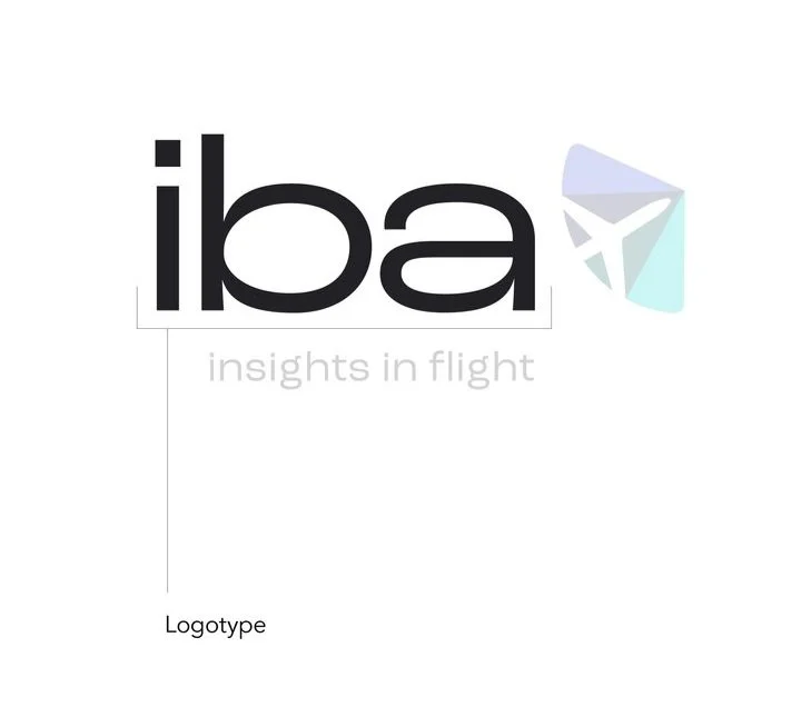
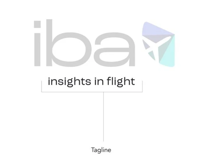
THE LOGO
IBA’s main concern was that their branding didn’t show their personality: professional, friendly
and top of our game.
Our first decision was to take their logo from capitals to lowercase - taking away the aggression and making it feel softer, whilst keeping it bold and modern with a strong san-serif font.
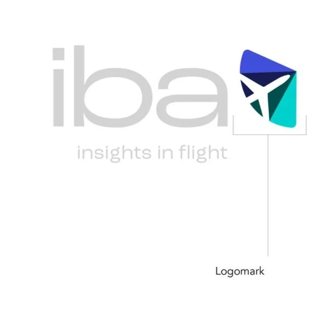
For the new icon, we’ve combined a common representation of data, a pie chart, with a simplified aeroplane graphic. It’s the epitome of the ‘joined-up’ business where asset management and advice meets valuations and data intelligence.
Data intelligence is our fuel, aviation is our world - joined together to show our customers we’re forward-thinking and unafraid to do
things differently.
Our new tagline is a clear, positive expression of the brand. It captures the benefits of their service and purpose of their brand. We’re about insights, not just data. We’re about aviation. We’re dynamic, proactive and customer focused.
All coming together in one neat animation…

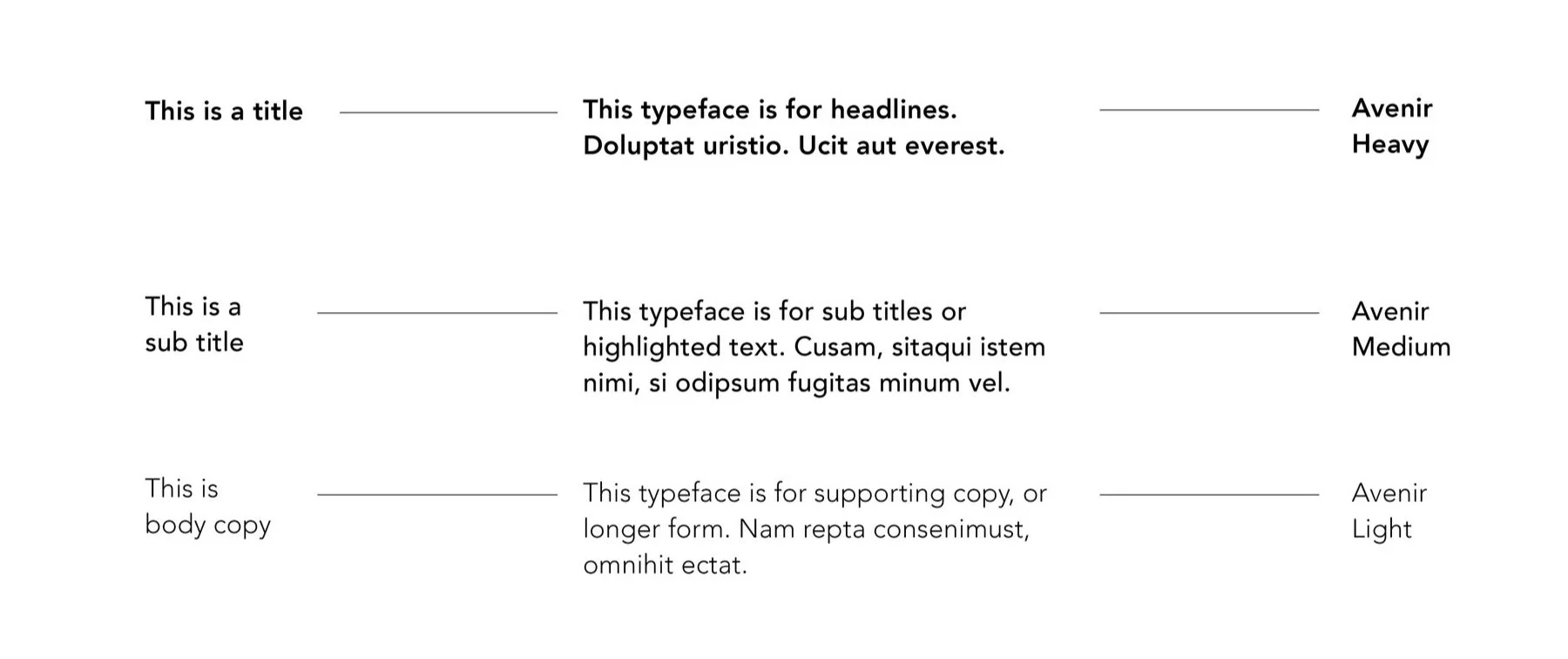
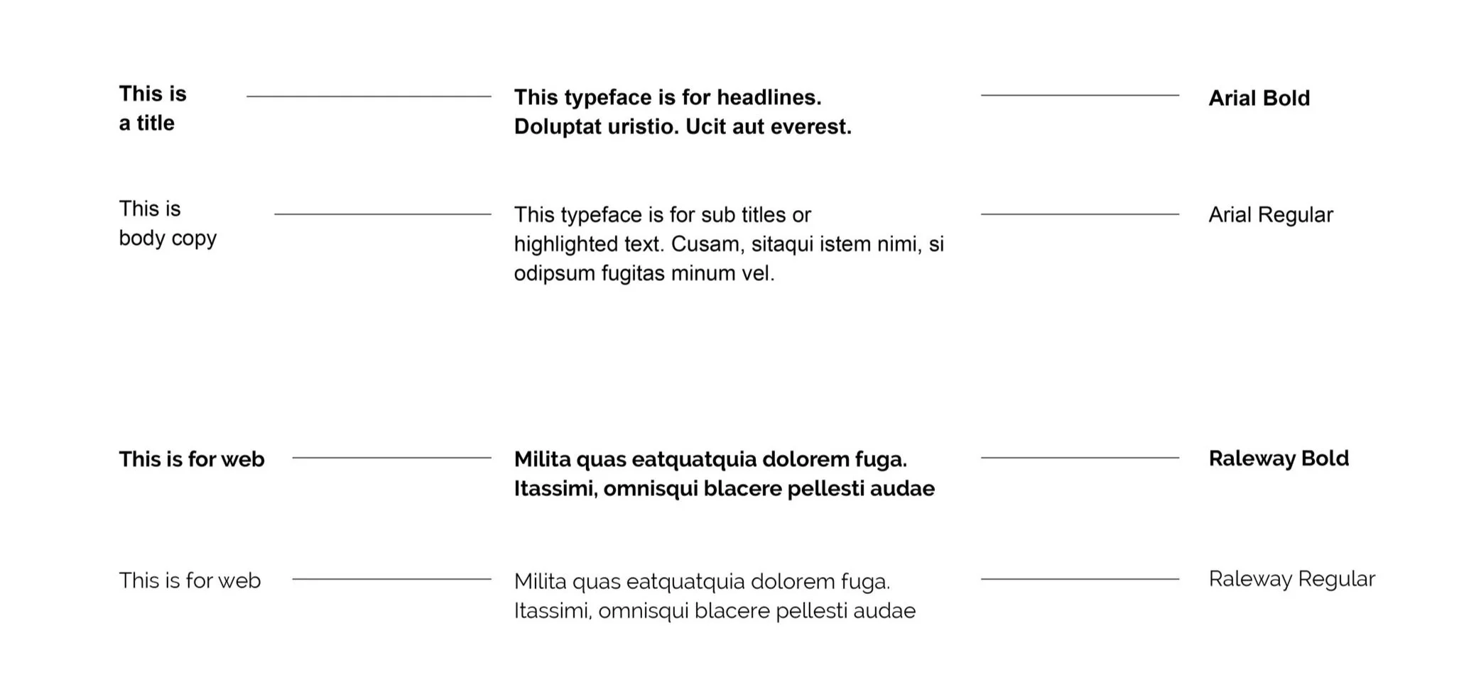
THE FONTS
Good typography makes a design slick, and with IBA’s new logo in place, we moved on to cherry-picking the perfect fonts.
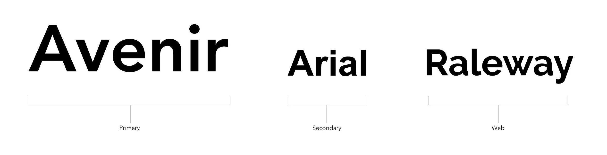
PRIMARY FONT
SECONDARY FONT
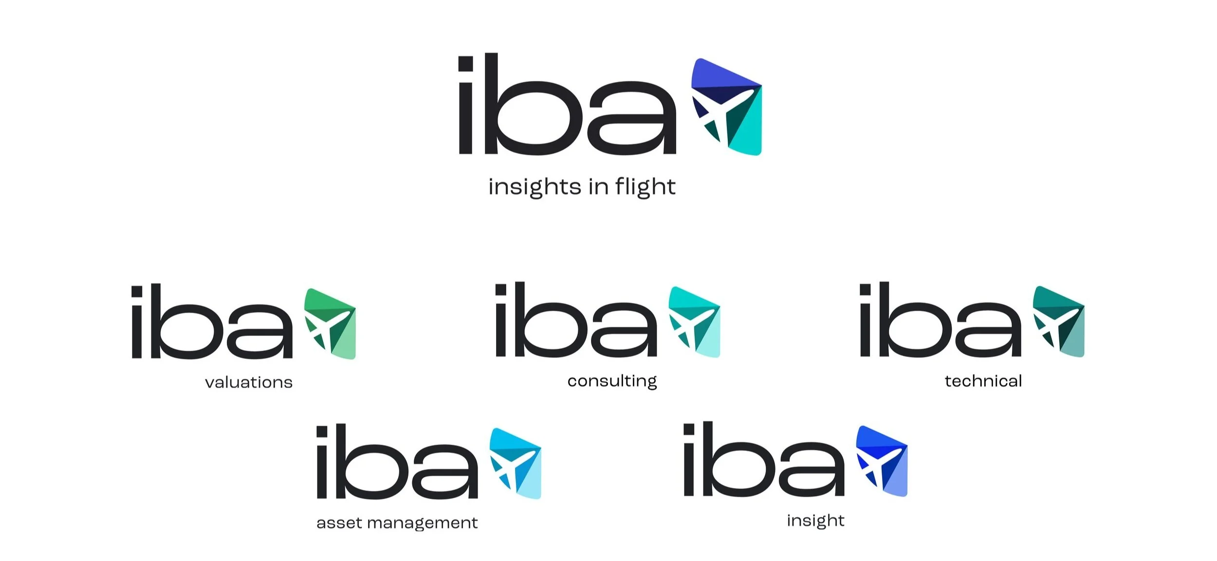
SUB-BRANDS
We’ve created five sub-brands that can be used when representing a specific part of the business or communicating to specific audiences.
These sit clearly underneath the IBA umbrella and are visually consistent with the master brand.
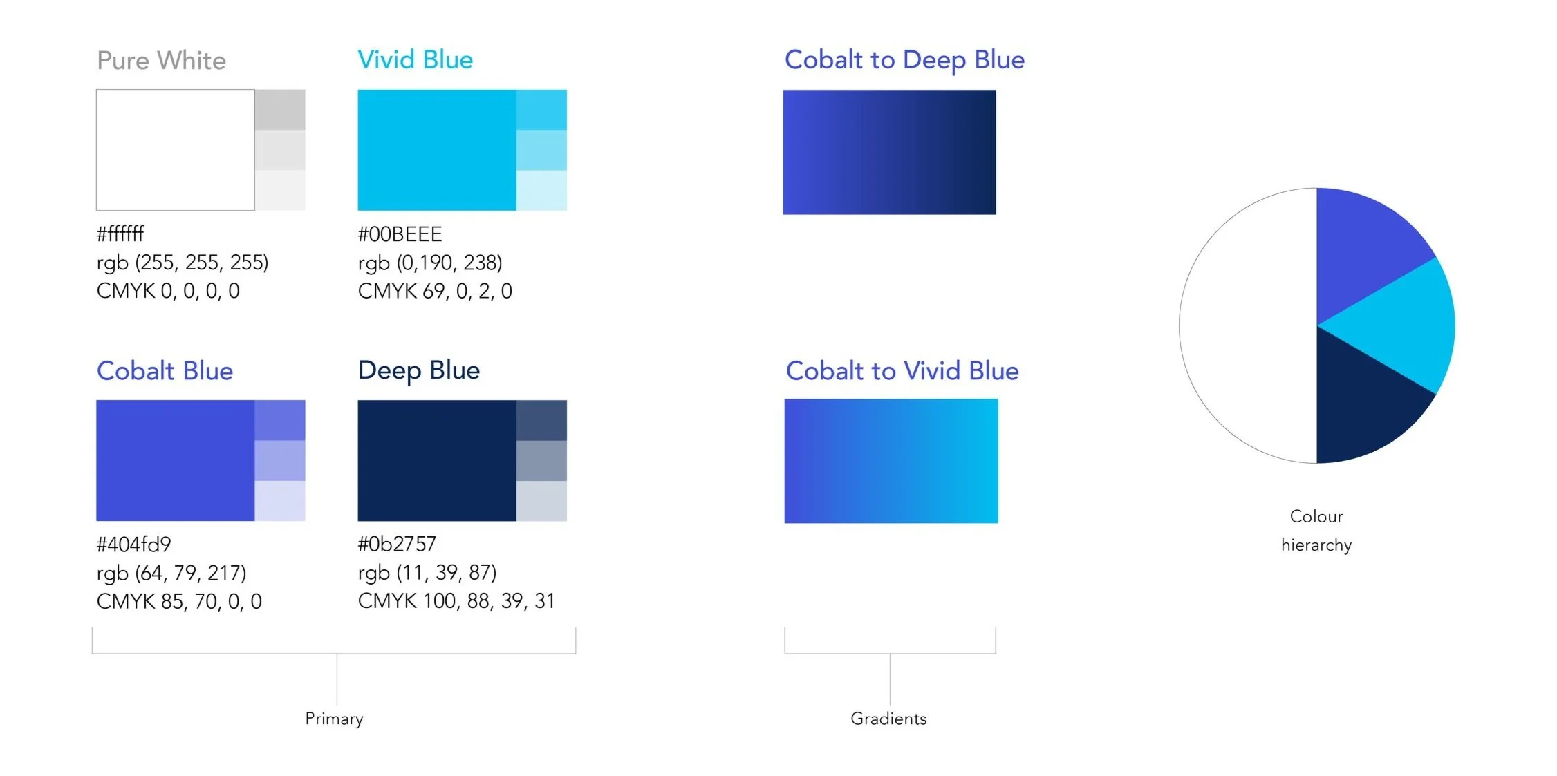
COLOURS
Alongside white – which must always be the main component when designing an asset – our primary colours are Vivid, Cobalt and Deep Blue. For bigger areas that need to be in colour, use a gradient transition between the different shades of blue.
Our primary palette of blue shades gives us enough variation across all assets.
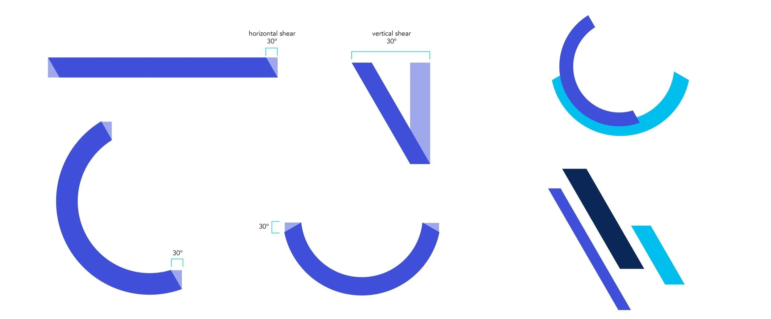
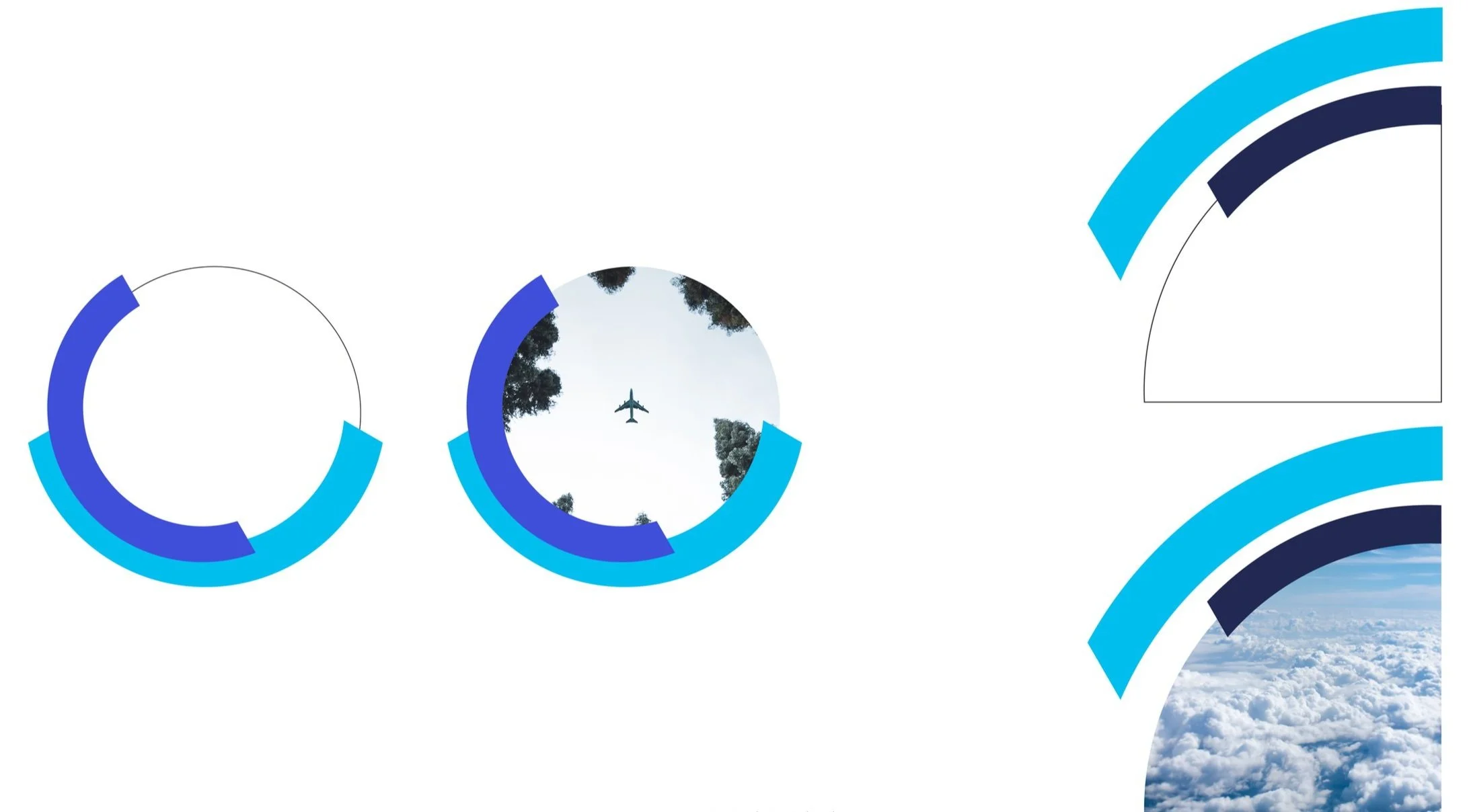
GRAPHIC ELEMENTS
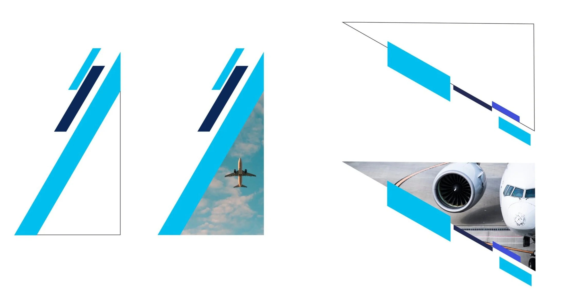
When creating design assets, one of the main graphic elements will be our set of dynamic shapes, both angular and curved. They are used as dividers, backgrounds, corners and alongside photography.
When the dynamic shapes are used alongside photography, we enclose imagery in a shape that follows the same angles and curves.
THE BRAND IN ACTION